Load
Install the SDK with npm or load it from the CDN. Include the base SDK, your theme, and only the Pixel components you need.
Add payment-method collection, checkout, saved payment methods, AutoPay, payment history, and account management to your application. Integrate with HTML, React, Angular, or Vue, then style each Pixel to match your design system.
Install with npm or load from the CDN
Start with one Pixel or combine several to create a complete payment portal. Every component shares the same security model, event interface, and theming system.
Card, bank-account, and digital-wallet information stays in Paymentus-hosted fields while customers complete a branded payment form.
Explore Tokenization Pixel →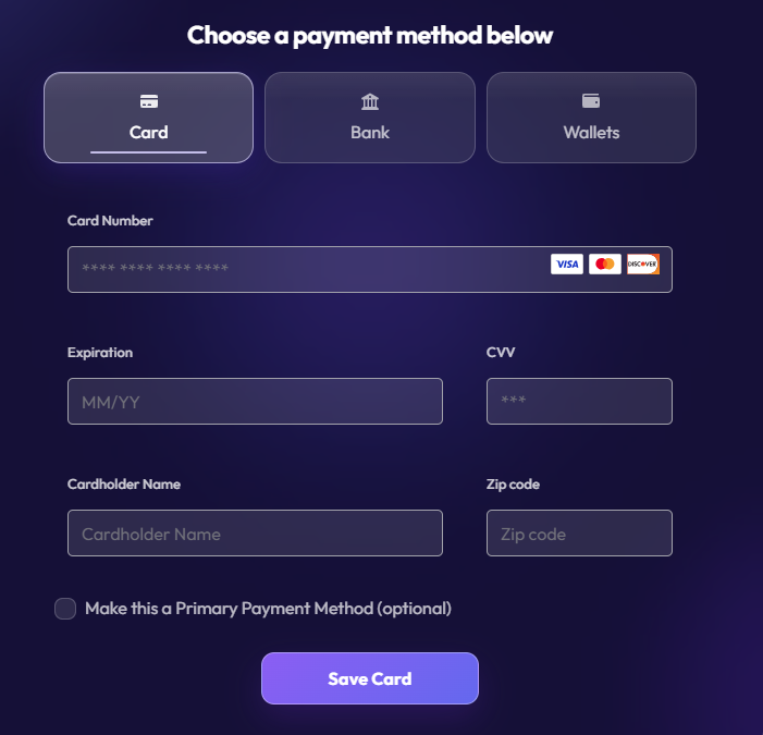
Load the SDK, authorize the current session, add the component, and handle its events in your application.
1<paymentus-base2authorization="ey...">3 <tokenization-pixel></tokenization-pixel>4</paymentus-base>Install the SDK with npm or load it from the CDN. Include the base SDK, your theme, and only the Pixel components you need.
Use component attributes and CSS custom properties to control behavior and visual styling.
Respond to success, error, and lifecycle events in your application.
Control colors, typography, spacing, corner radii, icons, density, and layout with CSS custom properties, component attributes, and ::part() hooks. Start with the included light or dark theme, or create a custom theme for your application.
--pmt-*)::part() styling hooks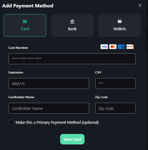
Same component, your palette. The Tokenization Pixel rendered with a dark theme. No separate dark-mode implementation to maintain.
--pmt-primary#8469FFPaymentus-hosted fields send card and bank-account information directly to Paymentus rather than through your host application.
Read security overview →Generate and preview an integration in the Paymentus AI Editor, or connect your AI coding assistant to the read-only Paymentus MCP server for Pixel component contracts, authentication guidance, integration documentation, and REST API v3 schemas.
Describe the payment experience you want. The editor builds an integration using the current Paymentus SDK, previews it in the browser, and lets you export the generated code.
The Paymentus MCP server makes Pixel component contracts, integration guides, authentication flows, and REST API v3 schemas available to the editor or AI coding assistant your team already uses.
Create a consistent experience across checkout, saved payment methods, AutoPay, and account management.